Dashboards
There are a number of informative dashboards that come with Energy Manager. Most are available on the free tier, but a limited number are reserved from premium subscribers.
Home Assistant ApexCharts
Energy Overview Dashboards
Tab 1
The first tab of the Energy Manager dashboard shows you the current buy and sell price. It also shows today's weather and the weather forecast for the next four days. An energy plan for the next 24hrs is shown under the 24hr pricing forecast. It also shows solar estimates for the coming week, as per how you have configured your Solcast settings.
Tab 2
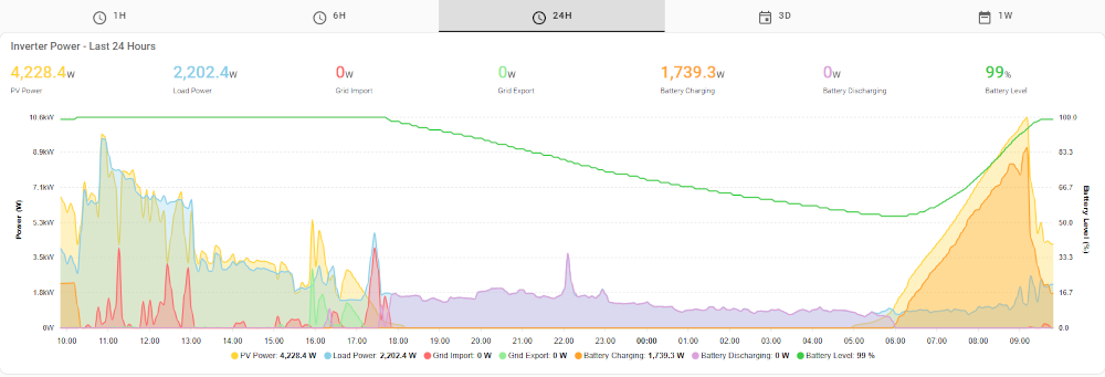
The second tab shows a timeline graph of your PV generation, house load, grid import and export, battery charge and discharge, along with your battery level. This graph has various tabs across the top so you can zoom in closer on certaim time periods, or zoom out and have a look up to a week's historical data.
The Costs dashboard
This dashboard will show you an estimate of what Home Assistant believes your electricity costs are for the time period. Note that this is NOT what you will be paying to Globird - it is purely an ESTIMATE and excludes any costs that have not already been passed into your buy and sell pricing. Use it as a general indication of how the month is going, not how much you will owe at the end of your billing period.
The following are some of the graphs on this page:
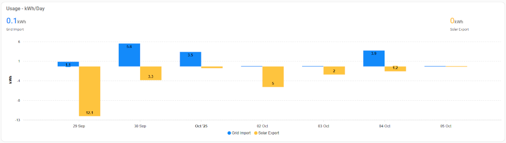
Usage - kWh/Day
This dashboard shows the amount of energy imported by your system, and the amount of generation that was suplus and was exported to the grid, over the last seven days. This excludes any curtailment as the amount that you "would have" generated is completely unknown.
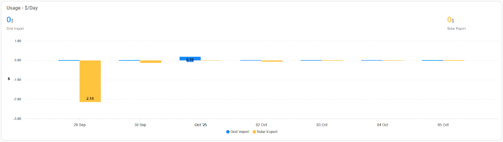
Usage - $/Day
This dashboard indicates to you the likely cost of power usage, and profit made by export, per day for the last seven days.
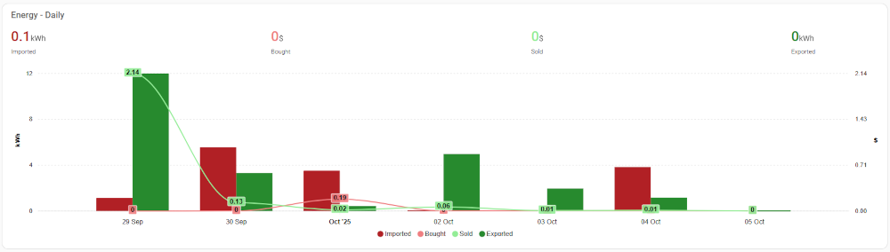
Energy - Daily
This is in a way similar to the first dashboard above (Usage - kWh/Day) except for it includes appropriately estimated costs or profit by doing so.
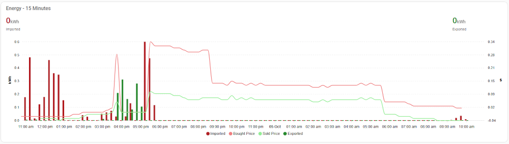
Energy - 15 Minutes
The last of the dashboards on this "Cost" page show 15 minute energy import or export, along with the buy/sell pricing at that time.
Grafana
Grafana can provide some very nice visuals and more grafana dashboards are planned to be released over time.
Energy Monitoring
The energy monitoring dashboard provides a wealth of near real-time information all from one place. From generation to usage, solar and pricing forecasts, battery level, to estimated costs so far for today and for the month. This dashboard is also responsive so should work well on your mobile phone.
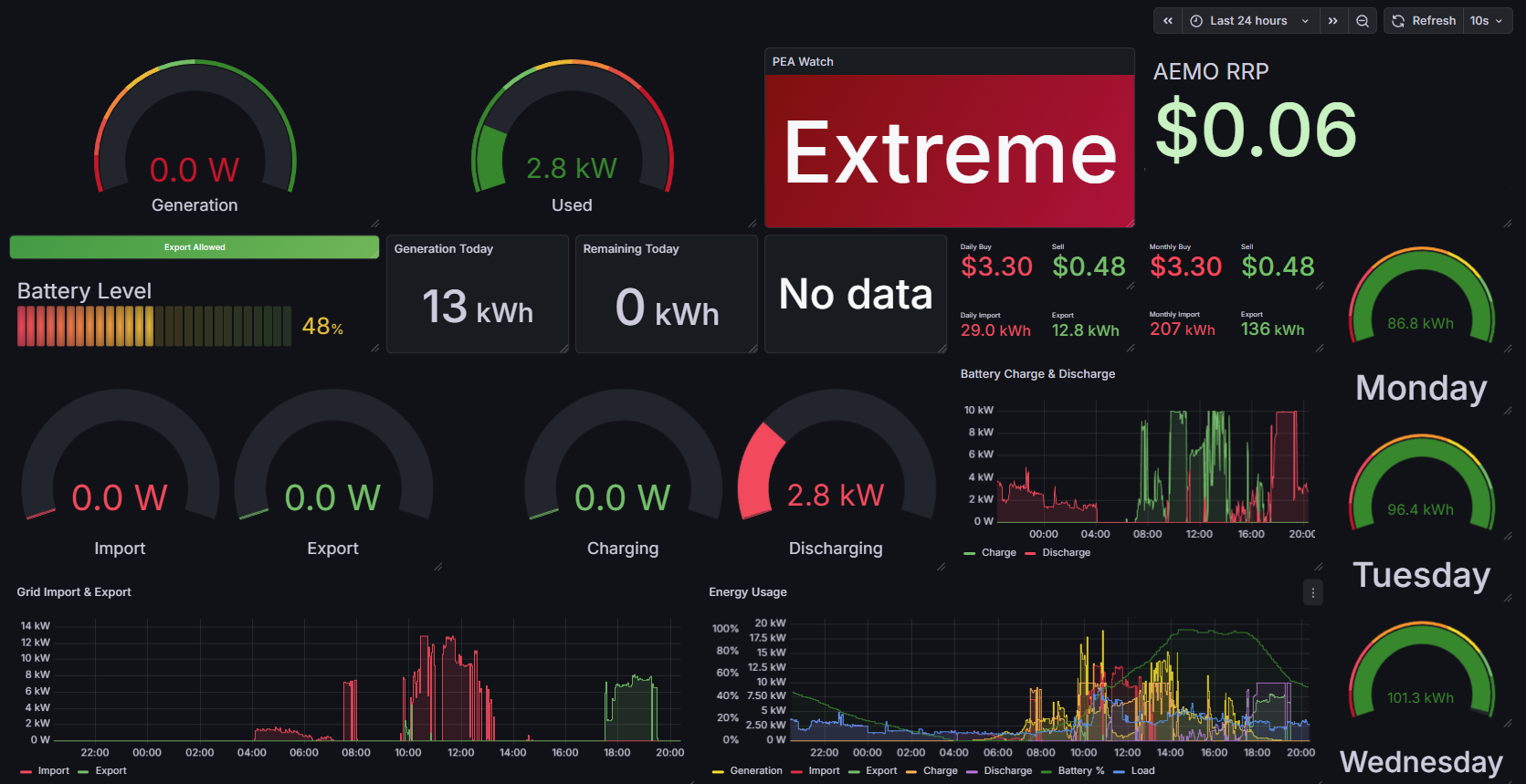
Note: Chart may differ according to energy provider selected.
You can go directly to the other sections of this configuration page below: